Customer Connect
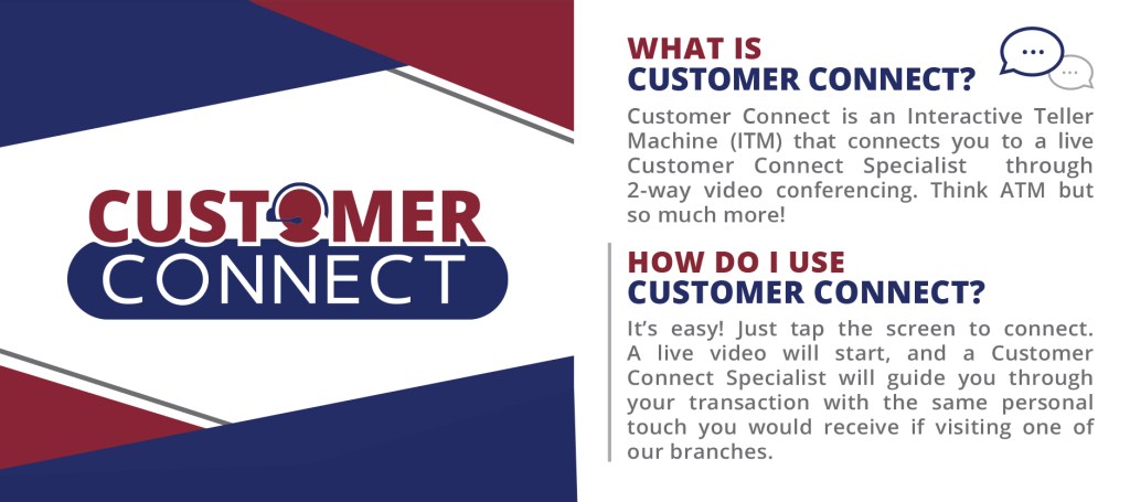
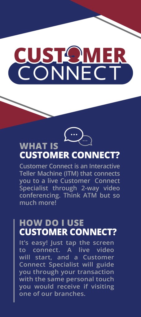
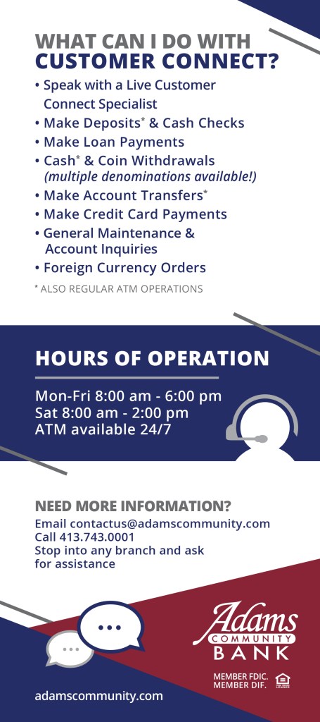
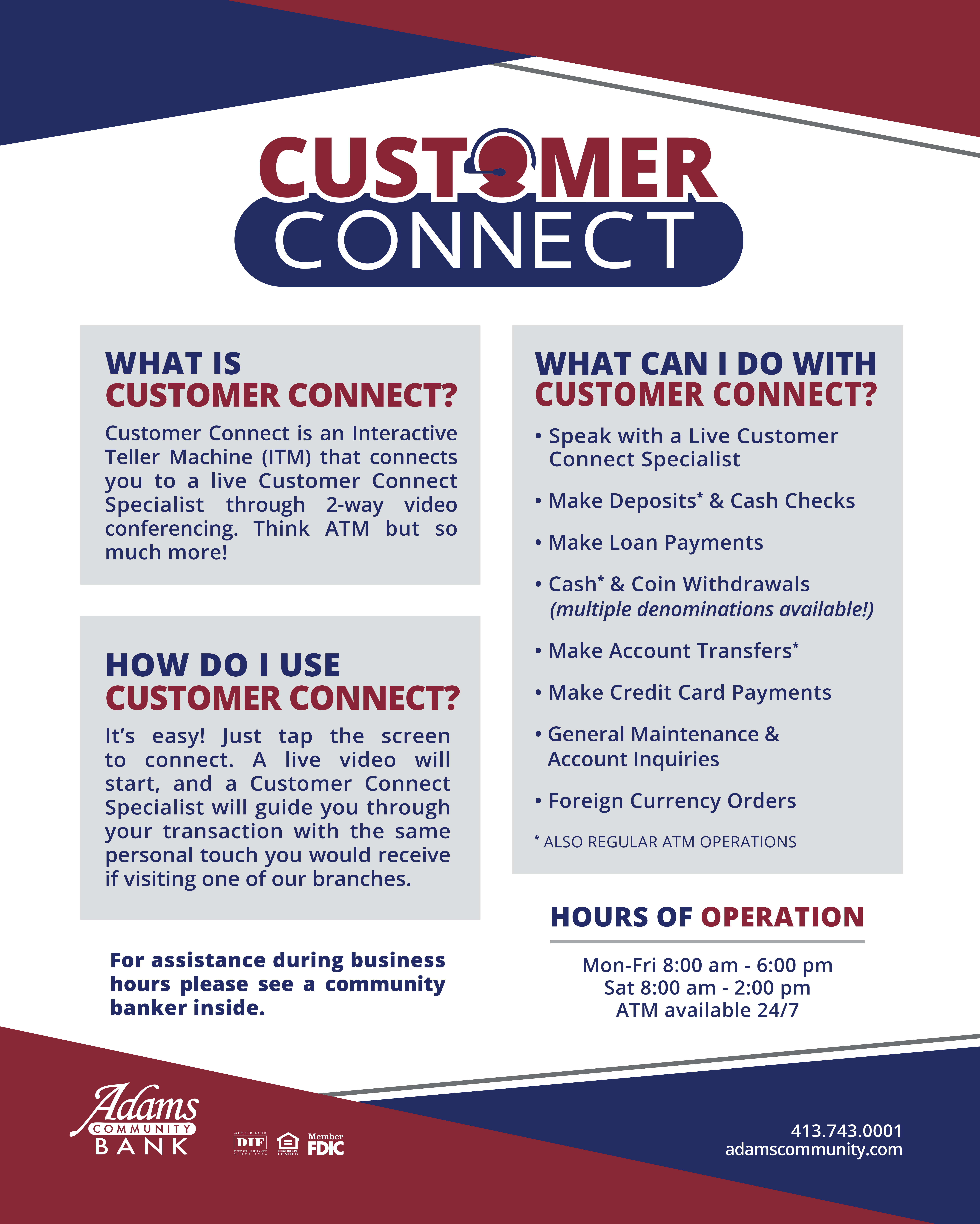
Adams Community Bank has provided the best possible service to its customers for more than 150 years, driving them to introduce Customer Connect – an Interactive Teller Machine geared toward ease and convenience.
Resembling the well-known ACB logo, incorporating a customer service representative, and keeping the design simple were the main concerns for this project.


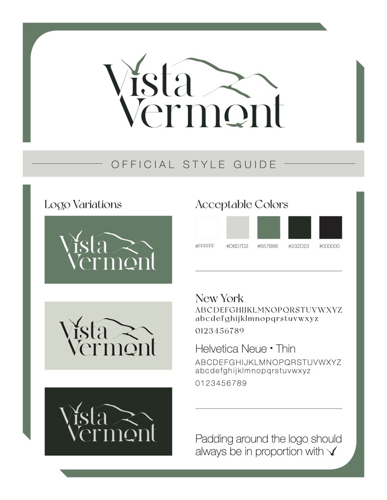
Vista Vermont
Recently I was tasked with redesigning the logo for a retail store in upstate Vermont. This client was seeking an ‘organic’ logo that paid tribute to the Vermont mountains while putting attention on a bird spreading its wings.
They were tied to a green color scheme as another tie to the Green Mountain State, and wanted a typeface that was sophisticated but still felt natural.
Five Guys Bus Co.
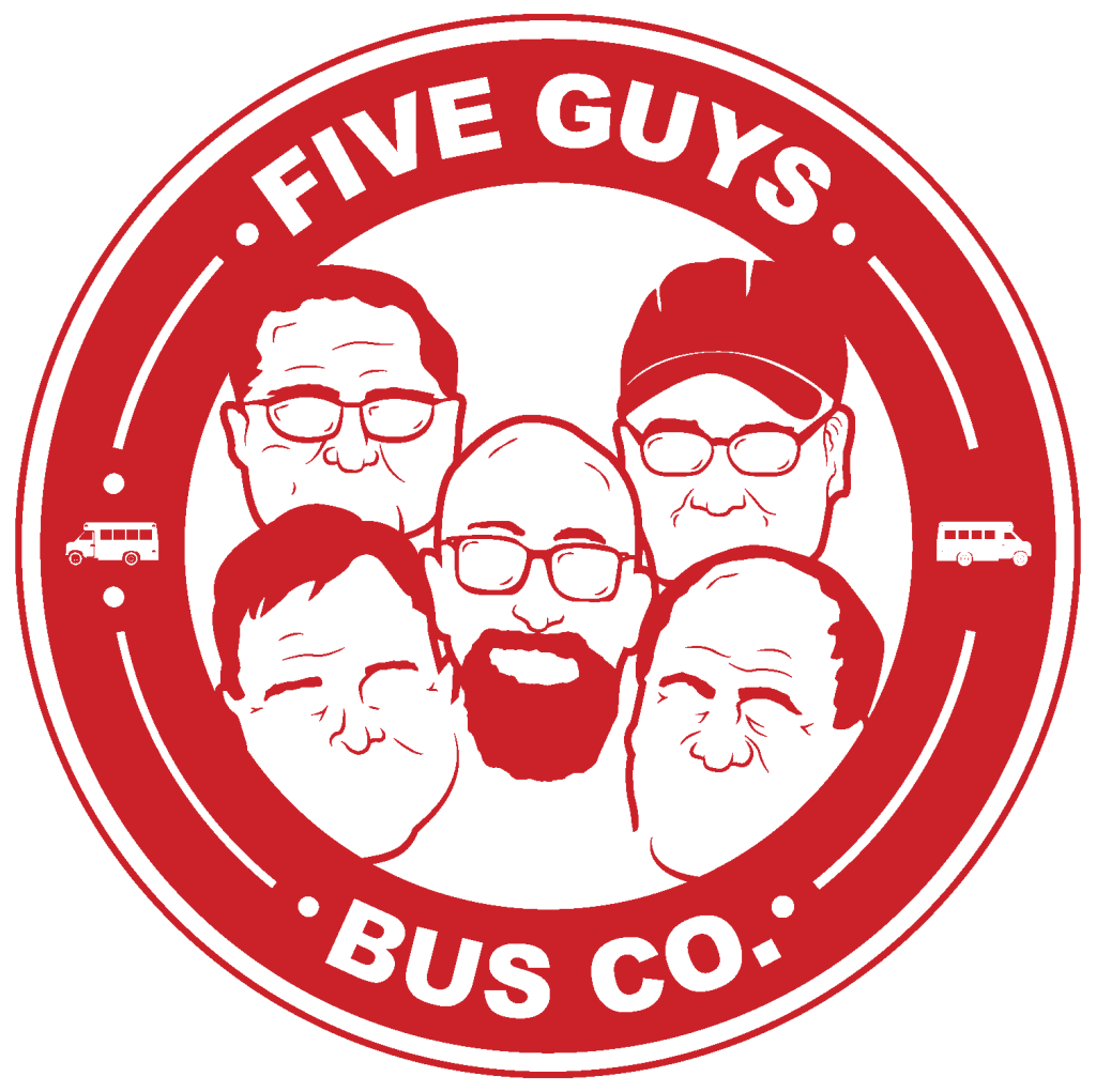
When 5 guys approach you to come up with a concept for their brand new bus company, you don’t hesitate to say yes. Inspired by the Five Guys™ Burger Company, they wanted something playful that still got their message across.
I chose to let their personalities show by incorporating their defining facial features. Through the use of circles and bus imagery people can conclude that is is a transportation company — the circle is more than a badge though, it also represents tires and movement.
Natty Ice
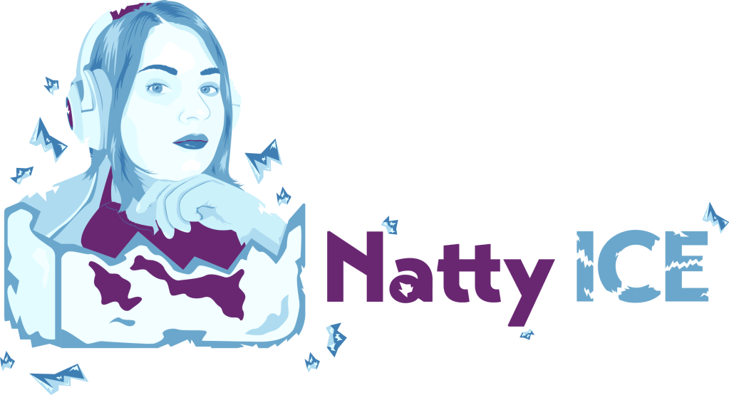
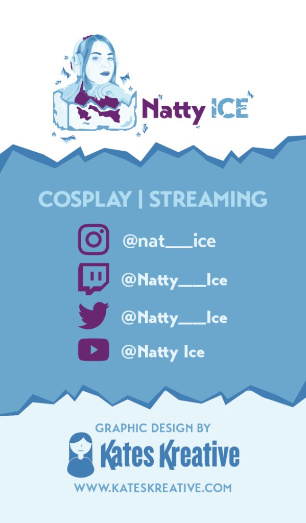
This was a fun project for an amateur cosplayer and video game streamer. The client gave me free reign to develop her logo and business card design.
Since so much of her work relies on her exuberant personality, I wanted these designs to reflect that.
The client’s face is a large part of her brand, so I knew I wanted to feature it in the design — the hard part was: how was I going to tie in the ice factor?
I chose to depict the client breaking through an ice cube and shattering it to bits. But why? They weren’t just trying to make a name for themselves, they were quite literally breaking into a crowded community of content creators.
Taconic Golf Club
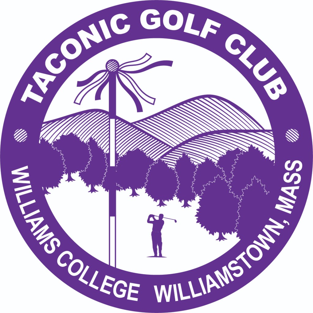
One of the premier golf courses in New England, Taconic Golf Course was looking for an update to their iconic logo. Keeping the same concept of the trees and show stopping Berkshire Mountains, I modernized the design.
Incorporating a golfer, adding more trees to reflect their years of growth as a club, as well as their new flag sticks — this logo meshes their recognizable original logo with their new aesthetic.

Splinters Rustic
Country Crafts
A conceptual logo design for a local wood craft company in Vermont. This brand used recycled wooden pallets to craft everything from bird-feeders, coat racks, key holders, and more.
They wanted something unique to their brand that also represented how they work. I did so by incorporating the silhouette of VT state, nails, and a hand saw.
John Jay Tree Service
Helping local companies develop an identity is one of my favorite things to do as a designer. Seeing it go from an idea in someone’s head to a fleshed out brand is incredibly rewarding.
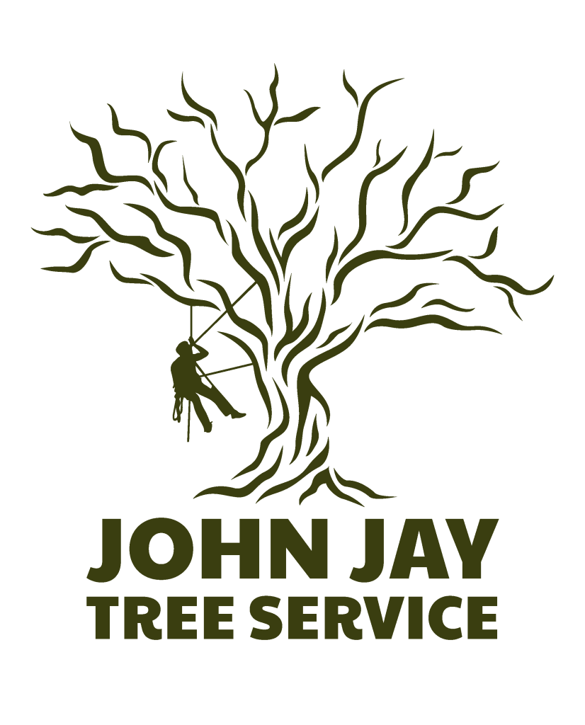
This client wanted a little bit of everything — he was inspired and eager to get things off the ground. He liked the look of a tribal tree, but wanted to somehow mesh it with his tree service. I was able to explore a masculine feel with heavy contrast. The light branches of the tree on top of a solid foundation of text will help the customer feel supported and helped from the ground up.
Kindling A Storey
Publishing Podcast
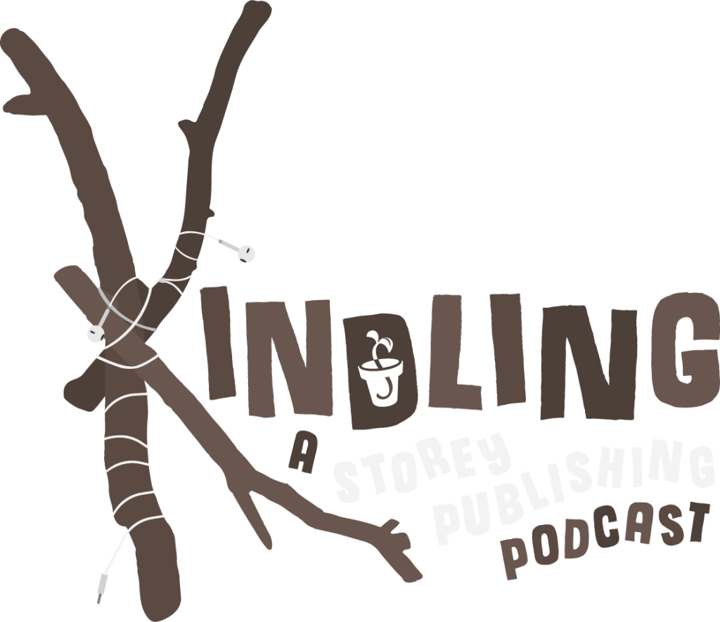
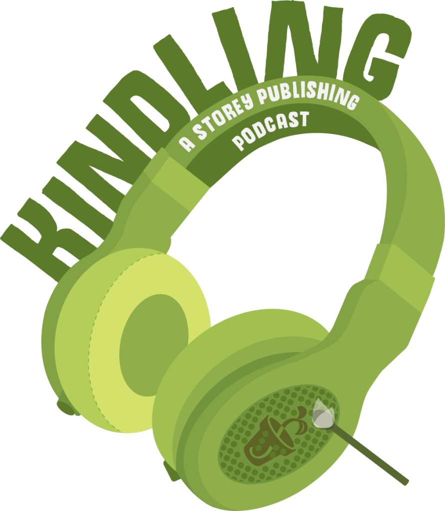
While I was working at Storey Publishing as a Junior Graphic Designer, our Marketing Department was challenged with coming up with a logo for the brand’s new podcast.
I chose to do something playful that would appeal to a younger audience to grow our demographic. I also felt that these logos showcased my personal design style, which I would describe as playful and conceptual.
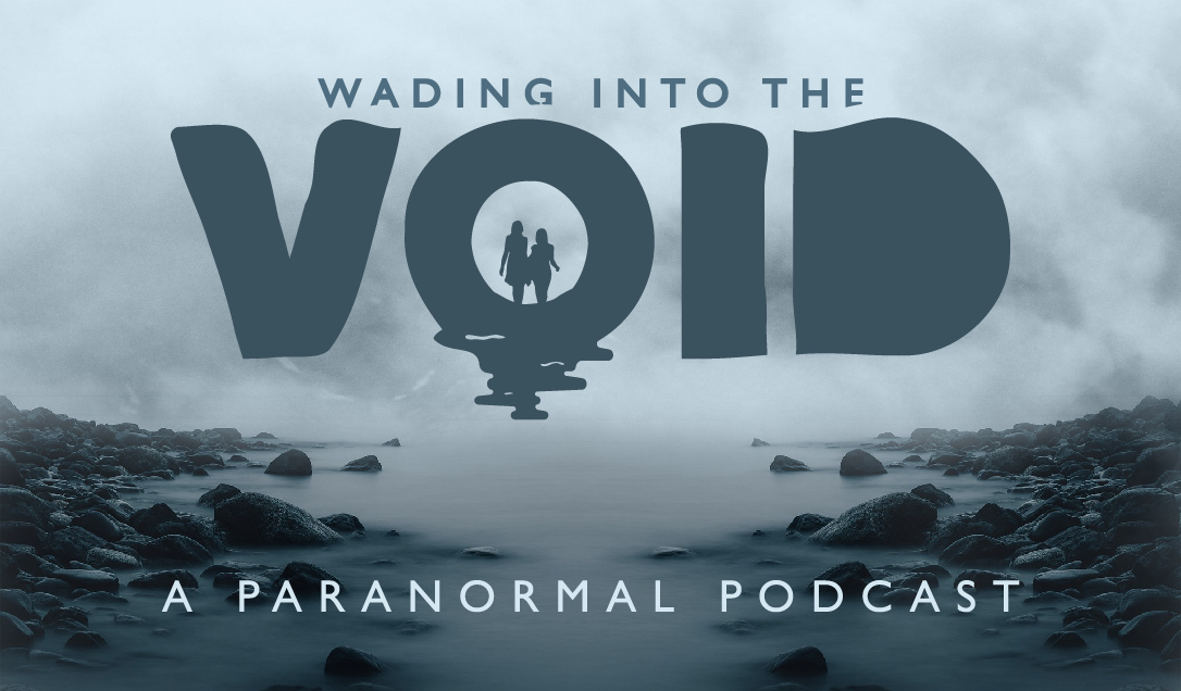
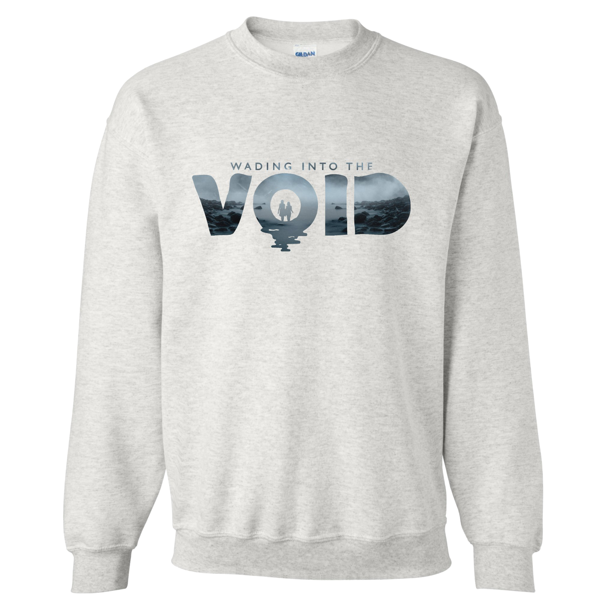
Wading into the Void
Recently my friend Natalie and I decided to throw caution to the wind and start a podcast.
We both love the paranormal and everything that goes bump in the night. We talk about crazy stories and weird occurrences all the time, so we figured why not share our ramblings with everyone else?
A paranormal podcast with a spooky feel but kept light enough through jokes galore, our podcast lets the world into the wacky subconscious of our minds while letting them learn more about some of the world’s most terrifying tales.
